Decorators & Theming
Real-world components do not exist in a vacuum; they depend on design system tokens, color palettes, typography scales, shape definitions, and composition locals.
In Storytale, you can apply decorators and theme wrappers to ensure your components render in realistic contexts.
1. Composable Theme Wrappers
Because Storytale's content lambda is standard @Composable Story.() -> Unit, applying a theme is as straightforward as wrapping your component with your design system provider:
import androidx.compose.material3.MaterialTheme
import androidx.compose.material3.Surface
import androidx.compose.material3.darkColorScheme
import androidx.compose.material3.lightColorScheme
import org.jetbrains.compose.storytale.story

val `Themed Card` by story(group = "Surfaces") {
  val isDark by parameter(false)
  val colorScheme = if (isDark) darkColorScheme() else lightColorScheme()

  MaterialTheme(colorScheme = colorScheme) {
    Surface {
      CustomCard(title = "Design Token Card")
    }
  }
}
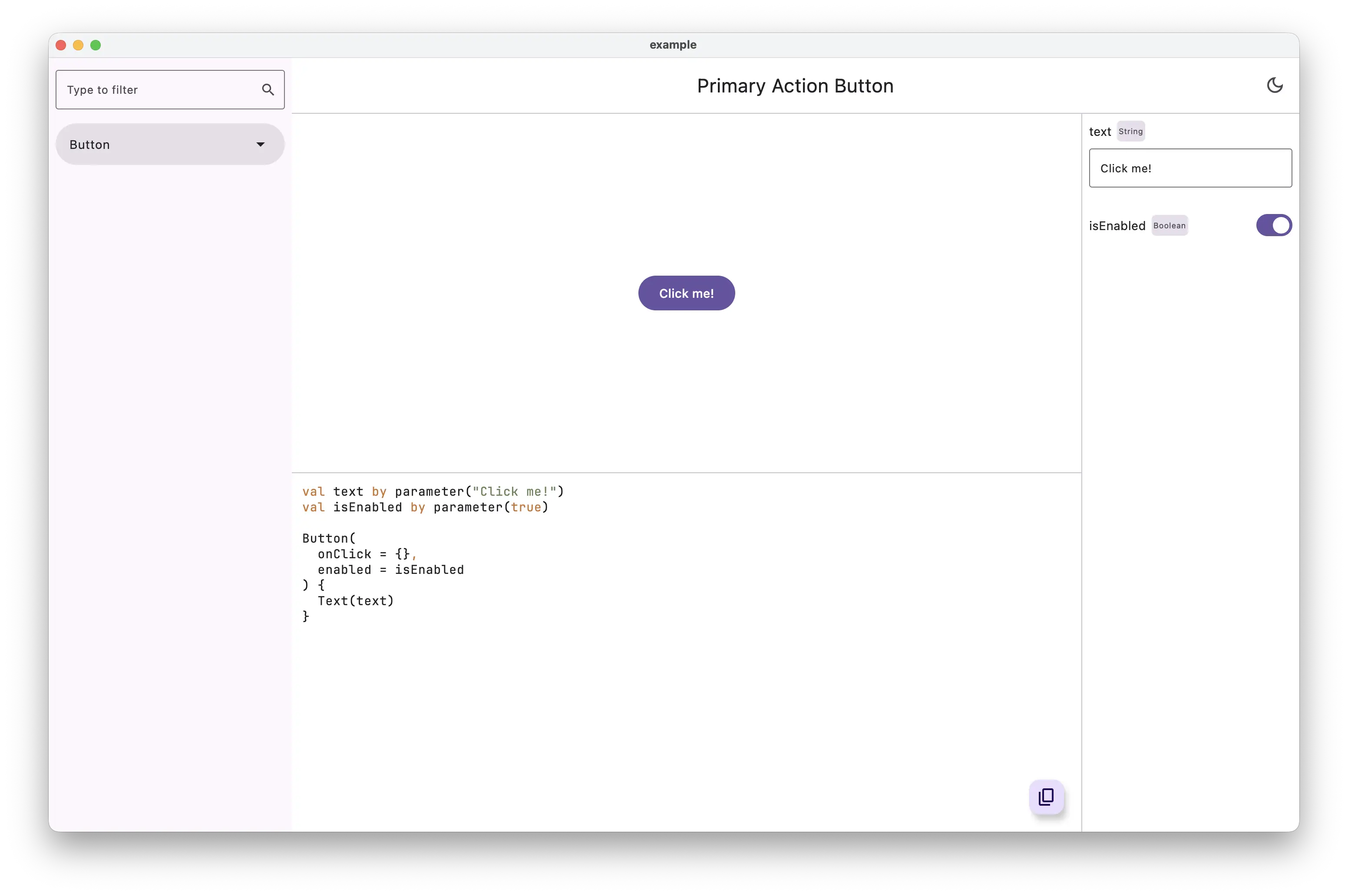
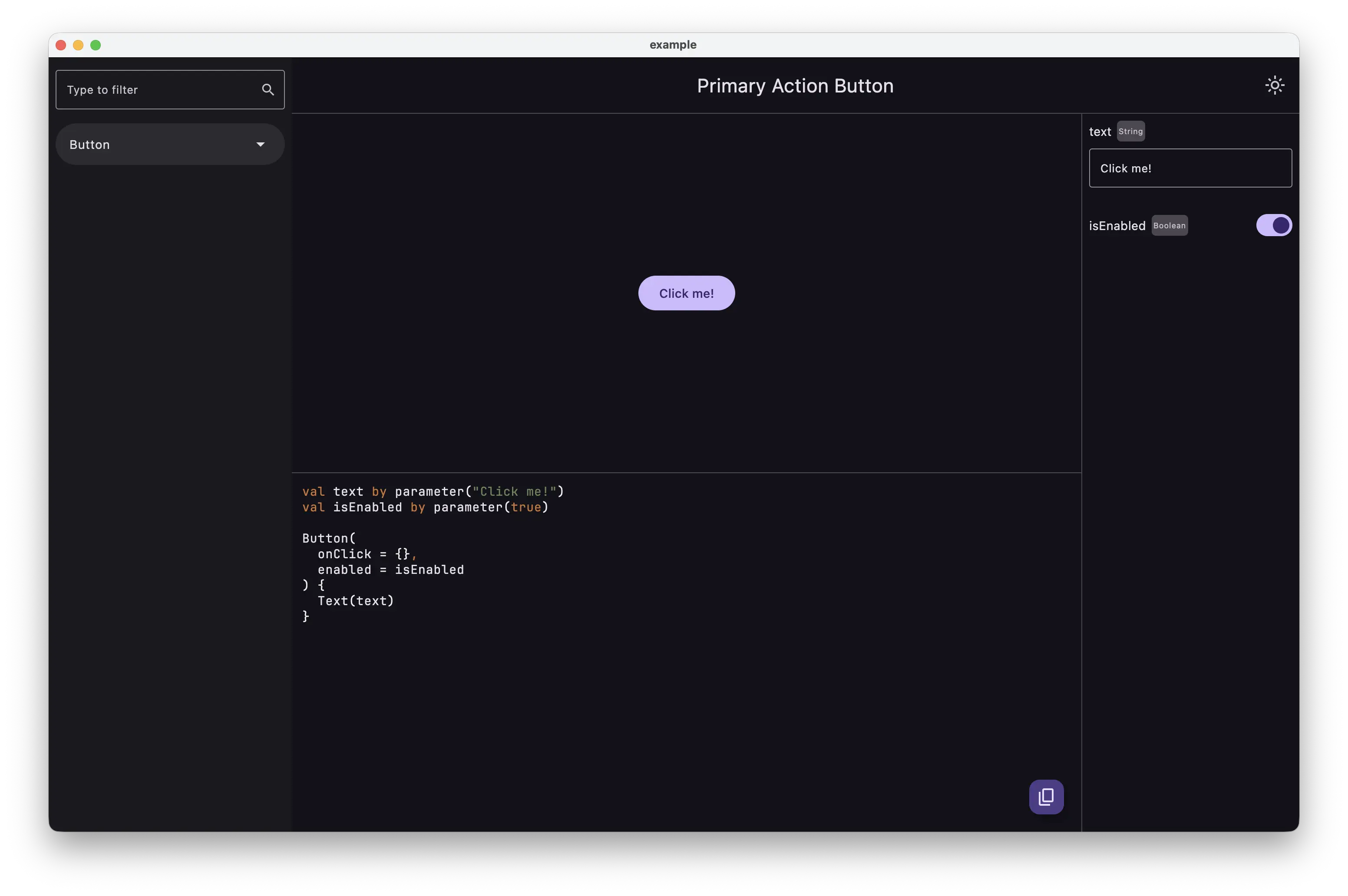
2. Reusable Story Wrappers (Story Decorators)
To avoid repeating theme setup, background containers, and padding in every story, create reusable extension functions on Story:
package org.storytale.sample

import androidx.compose.foundation.layout.Box
import androidx.compose.foundation.layout.padding
import androidx.compose.material3.MaterialTheme
import androidx.compose.material3.Surface
import androidx.compose.material3.darkColorScheme
import androidx.compose.material3.lightColorScheme
import androidx.compose.runtime.Composable
import androidx.compose.ui.Alignment
import androidx.compose.ui.Modifier
import androidx.compose.ui.unit.dp
import org.jetbrains.compose.storytale.Story

/**
 * Reusable decorator that provides Design System theme tokens,
 * background canvas surface, and standard preview padding.
 */
@Composable
fun Story.PreviewDecorator(
  modifier: Modifier = Modifier,
  content: @Composable () -> Unit
) {
  val isDarkMode by parameter(false)
  val themeColorScheme = if (isDarkMode) darkColorScheme() else lightColorScheme()

  MaterialTheme(colorScheme = themeColorScheme) {
    Surface(modifier = modifier) {
      Box(
        modifier = Modifier.padding(24.dp),
        contentAlignment = Alignment.Center
      ) {
        content()
      }
    }
  }
}
Then use the decorator inside your stories:
val `Search Bar Component` by story(group = "Navigation") {
  PreviewDecorator {
    val query by parameter("Search components...")
    SearchBar(query = query, onQueryChange = {})
  }
}
3. Providing Composition Locals
Components that rely on navigation hosts, image loaders, localization, or accessibility providers can be wrapped using CompositionLocalProvider:
val `Profile Avatar with Coil` by story(group = "Media") {
  CompositionLocalProvider(
    LocalAppConfig provides testAppConfig,
    LocalDensity provides Density(density = 2.0f)
  ) {
    Avatar(url = "https://example.com/avatar.png")
  }
}
4. Desktop Custom Themes (e.g. IntelliJ Jewel)
For Desktop-specific tools, Storytale integrates with specialized desktop themes such as Jewel (IntelliJ Platform styling):
val `Jewel IDE Tree` by story(group = "IDE Components") {
  IntelliJTheme(dark = false) {
    Tree(nodes = sampleProjectTree)
  }
}
Next Steps
Learn how to configure and execute your stories across all supported platforms in Multiplatform Workflows.